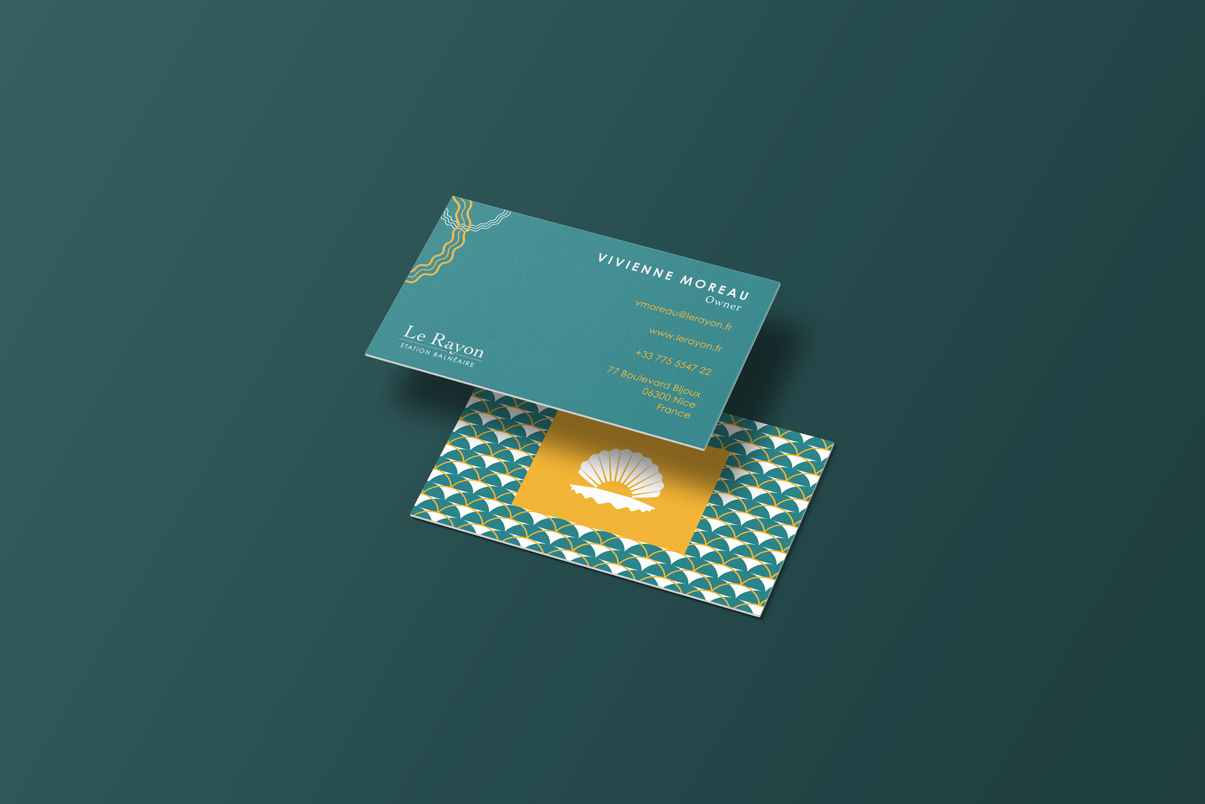


Le Rayon Station Balnéaire is a luxury seaside resort in Nice, France. It prides itself on creating a high-end, luxurious experience for its patrons where they feel that they are in heaven on earth. The name in English translates to “ray” or “beam”. Its target market is upper-class adults who have extra money to spend. Many may be retirees and likely enjoy traveling.
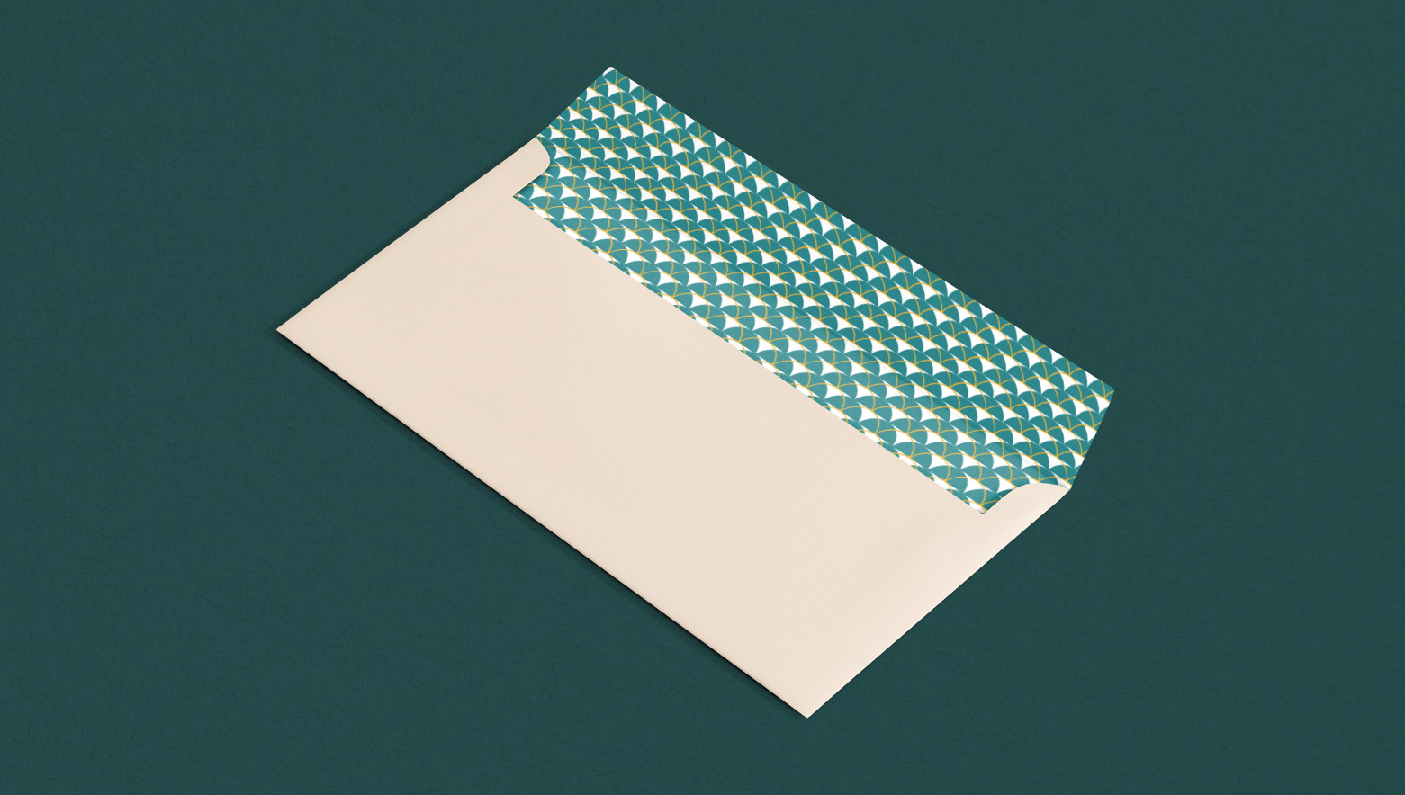
Their branding should evoke a high-end feel. The logo is based on a clam shell (sea element) combined with a sun. The sun comes from the name meaning ray and also acts as a pearl in the shell, which is considered to be very precious and rich. The logo can also be interpreted as a sunset. The color palette is based on the beach, with blues, yellow and tans, in addition to bronze and purple to represent higher-end materials and royalty. The stationary and shampoo/soap set patterns are based on scales and topographical maps. The scales are more ornate to evoke more sophistication while the topographical lines lean into travel, adventure, and worldliness which are all qualities valued by Le Rayon.